
Shipping Choice and Cart Abandonment: Optimizing Shipping Options Conversion
Your shipping presentation at checkout decides whether visitors buy or bail. Most sellers lose sales because delivery speeds, rush alternatives, and free-shipping thresholds aren't clear enough for fast decisions. Customers who can't quickly match shipping to their urgency and budget abandon carts—getting shipping options conversion right means removing that friction so they commit with confidence.
Confusing shipping options kill checkout conversion
Confusing shipping options kill checkout during peak summer traffic, when customers compare storefronts in seconds and decide fast. If delivery speed and cost aren't obvious, shoppers leave rather than decode labels like "expedited" or guess whether "standard" means three days or ten. Mobile viewports make this worse by cropping descriptions and burying free-shipping thresholds.
Customers expect transparent, easy-to-compare delivery speeds and costs in plain language with arrival dates—not vague tier names. A well-structured shipping selector shows exactly what they get and what it costs, so they can weigh urgency against budget without hunting footnotes or opening help docs.
Strategic presentation removes decision friction
When you group shipping options by speed, label them with arrival dates, and align them with free-shipping thresholds, customers choose faster. A tiered layout—Standard, Express, Overnight—paired with cost and calendar date lets shoppers match delivery to urgency without rereading options or second-guessing the choice that fits their budget.
Labeling and Visual Hierarchy
Customers scanning checkout make split-second judgments about which shipping tier fits their needs. That decision happens faster when you use labels everyone already knows—Standard, Express, Rush—rather than vanity names like "PriorityPlus" or "FastTrack." Familiar language removes one more micro-decision from an already friction-heavy moment.
Visual design guides attention before a customer reads a word. Whitespace around each tier creates breathing room that makes options feel distinct rather than overwhelming. Typography choices—larger fonts for delivery dates, lighter weights for auxiliary details—build a clear hierarchy: speed and arrival date first, price second, fine print last. Subtle color cues can highlight a recommended tier without misleading. A soft background tint or a small "Most Popular" badge draws the eye toward higher-margin Express delivery while keeping Standard and Rush visible and equally clickable.
Poor checkout layouts stack shipping options into dense, uniform rows with equal visual weight and no anchor point. Customers scan, re-scan, and abandon. Optimized layouts space tiers generously, lead with arrival dates in bold, nest pricing underneath, and mark the middle-tier Express option with a gentle highlight—not a hard sell, just a visual nudge that reduces decision paralysis. Customers see their preference instantly, click once, and move forward.
This isn't about manipulating choice—it's about making choice easier. When your checkout shows three well-labeled, visually distinct tiers with one clear recommendation, customers self-select with confidence instead of second-guessing. That confidence drives conversion, and the recommended tier—often the one with the healthiest margin—earns more clicks because it looks like the sensible middle ground, not the upsell.
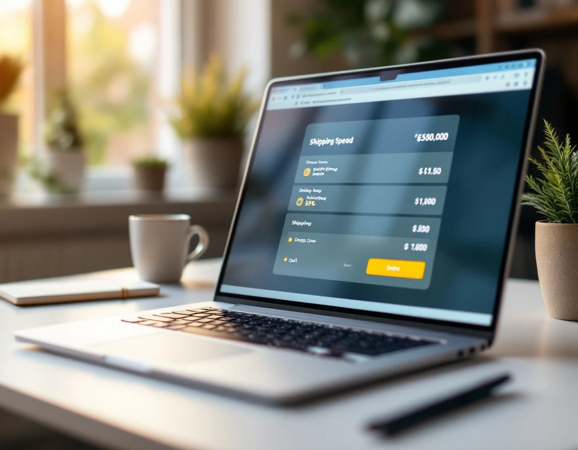
Delivery Speed Tier Structure
Most storefronts benefit from three to four delivery speed options that cover the urgency spectrum without overwhelming customers. A typical structure includes Standard (5–7 business days), Express (2–3 business days), Rush (next business day), and Next-Day (order by cutoff time for same-day dispatch). Fewer than three tiers can leave urgent customers stranded; more than four options create decision paralysis at the moment conversion depends on confidence.
Tier names matter less than clarity of the delivery window. Instead of vague labels like "Fast Shipping," display realistic delivery windows in plain language: "Arrives in 5–7 business days" or "Delivers by Thursday, July 12." This specificity sets accurate expectations and gives customers the information they need to self-select. A buyer ordering a birthday gift knows instantly whether Standard will arrive in time, or whether Express is worth the premium.
Including an estimated arrival date next to each tier reduces uncertainty and builds purchase confidence. Customers don't calculate delivery math or worry about missing a deadline. When the delivery date aligns with their need, they click "Place Order." When it doesn't, they choose a faster tier without friction. This structure turns shipping from a conversion blocker into a self-service decision point that matches urgency to budget—customer self-selection of shipping speeds becomes your checkout's biggest asset.
Free Shipping Threshold Strategy
A free shipping threshold is more than a discount—it's a conversion lever. When customers see they're close to qualifying, many add items rather than abandon their cart or pay a shipping fee. Set the threshold high enough to protect margins but achievable enough to motivate completion. For most storefronts, this lands somewhere between average order value and a modest premium above it, turning the threshold into a soft upsell mechanism.
Display the threshold transparently: "Free standard shipping on orders over $75" tells customers the rule upfront. A progress bar or counter message at checkout—"Add $12 more to qualify for free shipping"—gives real-time feedback without pressure. These visual cues work because they frame the decision as savings, not scarcity. Customers who were already close to the threshold often browse back to the catalog, adding a complementary product to cross the line.
This tactic drives both conversion and average order value. It respects the customer's budget while creating a clear incentive to increase cart size. When paired with well-labeled delivery tiers and arrival dates, the threshold becomes part of a broader checkout strategy. Let customers choose the shipping option that fits their urgency, then show them how to unlock free delivery if they're willing to add just a bit more.

Rush and Next-Day Options
Rush and next-day shipping capture customers who are ready to buy now but need the product fast. These premium tiers aren't last-resort upsells—they're deliberate rush delivery options for ecommerce that serve high-intent shoppers who will abandon the cart if the timeline doesn't work. When a customer sees "Arrives by Friday" next to a rush option, they're deciding based on need, not impulse. That clarity converts where vague "expedited" labels don't.
The key is factual urgency cues. Instead of artificial countdown timers or "limited slots remaining" pressure tactics, use real delivery windows: "Saturday delivery available" or "Ships today, arrives Wednesday." These cues let customers self-select based on their actual schedule without triggering decision paralysis. A parent ordering a birthday gift two days out will pay the rush fee. A customer with no deadline won't. The option does the work.
Placement matters as much as labeling. Rush and next-day options should appear alongside standard tiers. Not buried in a separate modal or revealed only after a customer starts to leave. Prominent placement signals that fast delivery is available without pressuring anyone who doesn't need it. When these premium options are treated as helpful alternatives—not hidden fees or panic buttons—they feel like part of the service, not a sales trick.
Testing and Optimization
Once your shipping options are structured and labeled, test what actually converts. Run A/B tests on label names, visual hierarchy, free-shipping thresholds, and default tier selection. Does "Express (2 Days)" outperform "Fast Delivery"? Does placing Rush at the top increase selection rates, or does it make Standard feel like a downgrade? Does a generous free-shipping threshold encourage more orders than a modest one? The answers vary by product category and customer base, so test the variables that matter most to your checkout when optimizing for shipping options conversion.
Track cart abandonment rates by shipping option to pinpoint where customers drop off. If abandonment spikes when Rush is selected, the price might be too high or the arrival date unclear. If Standard sees high abandonment, customers may be second-guessing speed. Segmenting abandonment data by tier reveals friction points that aggregate metrics miss.
August 2026 is the right time to run these tests. Summer peak season traffic gives you the volume needed to validate changes quickly, and adjustments made now will carry through fall. Use conversion data from this period to refine your presentation before the year-end rush.
If you're running a white-label storefront, partner portal, or drop-ship operation, PurchasePuffin's checkout tools let you test shipping logic, track abandonment by option, and adjust thresholds without rebuilding your CMS or storefront architecture. Volume pricing calculations, threshold triggers, and tier presentation all work inside the same platform—so you can refine conversion levers in real time. Explore PurchasePuffin's checkout optimization features to turn shipping from a decision bottleneck into a conversion driver across your commerce operations.